POTW: Enfuse Example
March 19, 2010 at 5:37 amHDR photography has been a popular thing for a few years now. The premise is simple; take multiple pictures of a scene at various exposure offsets and merge them together. This gives a final image that has more dynamic range than any one photo could take, which means you can see more detail in darker and brighter areas. Most HDR sucks. A couple reasons for this. One reason is what I call "super HDR." These are images that have such a large dynamic range to them that it shows more than the human eye could see. Occasionally, this wouldn't be bad, but I see people that do this for every single picture they do. Another reason is just the process of doing HDR. Without getting too technical, you merge the images and create what's called a tone-mapped image. You then need to tweak settings on this intermediate photo to get a suitable output. This can create things like halos around bright spots in the image. It can also mess with the colors and saturation of the image. In my opinion, a HDR image should mimic what someone viewing that scene in real life would see.
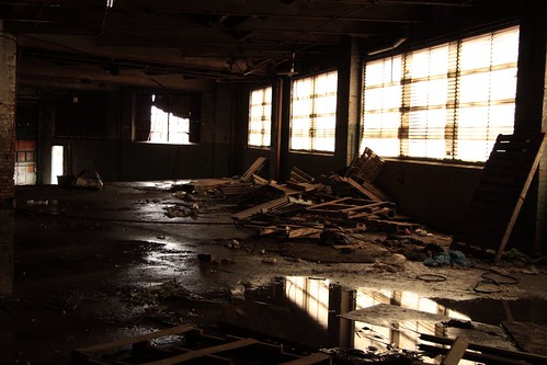
There is another method of merging several images together called--among other things--exposure fusion. In this method the images are compared and whichever image has the "best" pixel, as determined by several factors, is included in the final image. Some smoothing of the final image and it's done. This is a more direct approach as no intermediate file needs to be made. It's also much easier to do. The above image had all default settings. I like this over HDR because it produces a more realistic image. You may even been thinking that's just a single picture. Well, here's the first of the three images used for the above file.
My camera, a canon 40D, takes three pictures. The first one is at the proper exposure, which in this case had 0 exposure bias. It then takes (again, this can be changed) an image with -2 exposure bias and +2 exposure bias. With the image above being the first of the three, that means it's a single properly exposed picture. Some things should be immediate when compared to the top image. There's hardly any detail in the window and the windows on the right were blown out slightly. In the upper left corner there was hardly any detail. Even the reflection in the water has more detail in the enfused image.
I created the image with a program called enfuse. There are clients with GUIs for mac, windows, and linux. You can download it and get more information from here.
If you are having problems commenting, be sure you are not blocking third party cookies or allow 'intensedebate.com'

